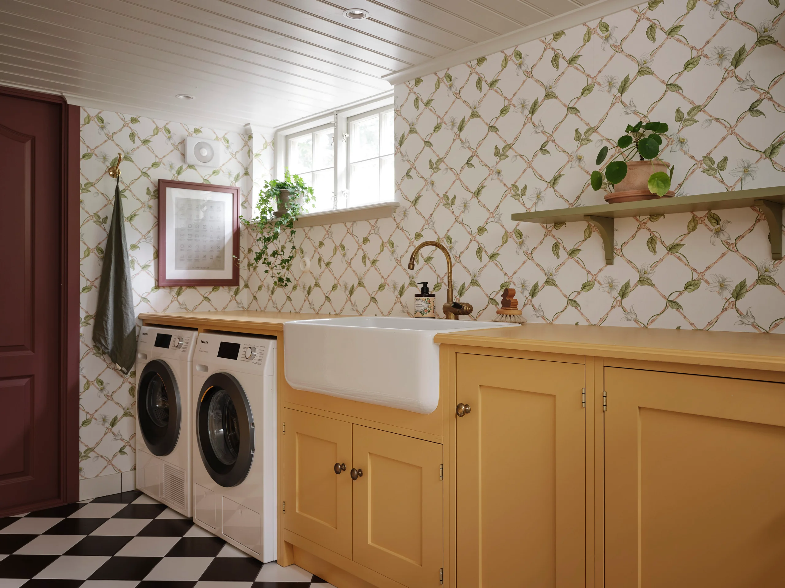
Colour defines the personality of your kitchen. Our palette of 17 hand-picked shades is designed to feel timeless but playful, from deep greens and blues to soft neutrals and warm tones.
Light affects colour more than paint charts do. North-facing rooms bring out cooler undertones, while south-facing rooms make colours appear warmer. Always test samples on site, on more than one wall, and check them at different times of day.
Mixing colours works beautifully. A common approach is a darker base and lighter uppers, creating balance and making the room feel grounded but open. Islands are also a great opportunity to introduce a contrasting shade.
Pairing with materials: deep greens and blues pair well with light stone or brass hardware. Soft neutrals shine with natural oak drawers and stainless steel appliances. Warm tones like Roasted Chestnut feel luxurious with marble and aged brass.
Think long term. Most clients who choose a bold colour never regret it. Our shades are rich without being flashy, so even daring choices age gracefully.
And remember: cupboards are painted inside and out, so every time you open a door or drawer, the colour continues. It feels like true furniture, not just a surface.